Camping Supply Store
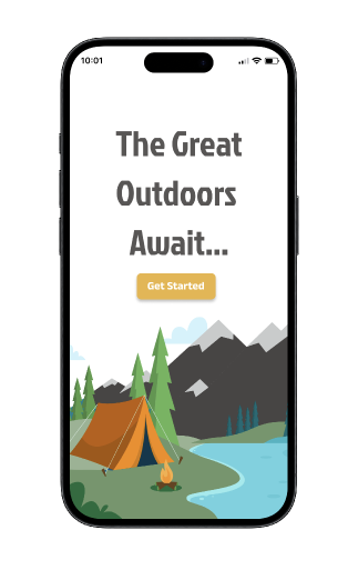
Designed a user-centered, visually appealing app to sell and advertise products for a hypothetical camping supply store.
Project Overview:
Roles & Responsibilities:
UX/UI Designer, UX Researcher, Storyboarding, Wireframing, Prototyping, Usability Testing
Project Duration:
December 2023 - February 2024
(2 Months)
Tools Used:
Figma, Adobe Illustrator, Google, Usertesting.com
The Problem:
Users feel overwhelmed with the amount of options listed on a given page and struggle to easily and quickly find the information they need, from the products they are looking to purchase.
The Solution:
Create an app that emphasizes easy navigation, clearly displayed information, and an appealing user interface, while minimizing clutter on each screen
The Process:
Research
Ideate
Design
Test
Launch
Research Methods
To do this, I conducted a competitive audit on 3 of the top “camping supply” stores: REI, Moosejaw, and Dick’s Sporting Goods. I supplemented these audits with secondary data to ensure I had sufficient data collection.
I needed to gather the necessary information to understand and empathize with the pain points that real-life users were encountering while online shopping with “big name” camping stores.
The Process:
Ideate
Research
Design
Test
Launch
User Personas, Journey Maps, and Flows
Based on the research I conducted, I created 3 user personas. I identified “Annita” as the user persona that would encompass the most common pain points. This user persona allowed me to more deeply empathize with our users and gain a better understanding of what this product needed to deliver.
Next up, it was time to create a User Journey Map for Annita, to better empathize with the thoughts and feelings users may experience while navigating a camping supply website.
The final step of the Ideation process was creating a User Flow Map. This illustrated the flow a user would take from the Home Page to Checkout.
The Process:
Research
Ideate
Design
Test
Launch
Low-Fidelity Wireframes
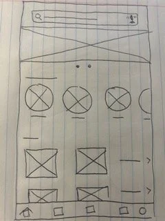
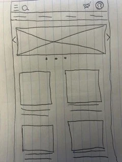
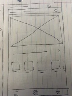
Once the research had been conducted, I moved on to designing a series of low-fidelity wireframes; beginning with paper wireframes.
From there, I turned the paper wireframes into low-fidelity wireframes.
Using the information gathered from research and the user persona to help guide this portion of the design process, I was focused on ensuring the layout of each page was clear and easy to navigate. Additionally, the information displayed needed to be neatly organized and avoid feeling overwhelming.
Low-Fidelity Prototype & Usability Study
Using the low-fidelity wireframes, I created the first prototype of this project.
This prototype was then used to conduct usability testing to get a better sense of how users would navigate the app and what pain points they may still encounter.
This feedback proved crucial to making necessary changes to both the wireframes and prototype, before moving on to the high-fidelity mockups and prototypes.
High-Fidelity Mockups
Once I had made all of the necessary changes to my low-fidelity wireframes and prototype, I was confident to move on to the high-fidelity mockup portion of this project. During this stage, I created both a component sticker sheet and a style guide, to ensure the UI was both visually appealing and consistent across the frames.
High-Fidelity Prototype
In the final stage of my design process I turned those high-fidelity mockups into a working, interactive prototype, to retest with users.
The Process:
Research
Ideate
Design
Test
Launch
Usability Test #2
The final portion of this process involved retesting the app. Users were asked, again, to complete a series of tasks and answer questions related to their experience and overall feelings towards the app.
The overall feedback proved to be overwhelmingly positive, with 100% of participants successfully completing each given task.
The Process:
Research
Ideate
Design
Test
Launch
Takeaways
As this was a project geared solely to help sharpen my UX design skills and gain more experience with the UX design process, there was no official “launch” of the finished product.
However, I thoroughly enjoyed every step of bringing this app to life. From the initial research to the final touches, it would be nearly impossible to list ALL of the things I took away from this project. So, I’ve done my best to narrow it down to three:
Decipher the difference between keen attention-to-detail and “paralysis by analysis”.
Honest feedback is good feedback - write it all down.
Ask questions - lots of them.
Looking forward to all the progress to come! Until then… happy camping! :)


